Responsive Web Design
ASPCA Responsive Web Redesign
The Problem
The ASPCA website was built to generate donations first and facilitate adoptions second. Our audit found dead-end links, depressing imagery, inconsistent pet profiles, messy navigation, and a "Donate, Donate, DONATE!" tone that caused users to leave before ever connecting with an animal.
The Solution
A warmer, more transparent adoption journey that users can actually follow and trust, one that lets people track their progress instead of guessing what happens next.
Potential pet owners need detailed adoption information and process clarity up front. A lack of transparency creates distrust, which leads to users leaving the website and not adopting.
Journey Map — Jasmine's Story
Meet Jasmine, a cat owner who recently lost her dog and is finally ready to open her heart to a new pup. Her expectations: find a dog that matches her lifestyle, clear and timely communication with the shelter, and an intuitive, emotionally positive experience.
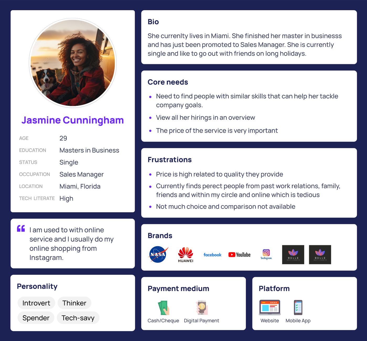
Jasmine's refined user persona
Priority Matrix
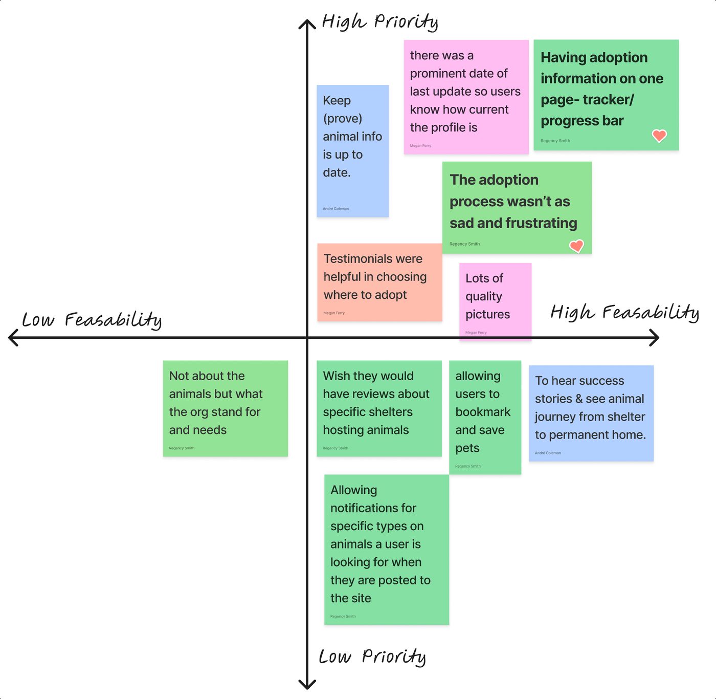
We used a priority matrix to align the team on what to tackle first. Top priorities: letting users track their adoption progress, and keeping the experience from feeling depressing or emotionally manipulative.
Wireframes
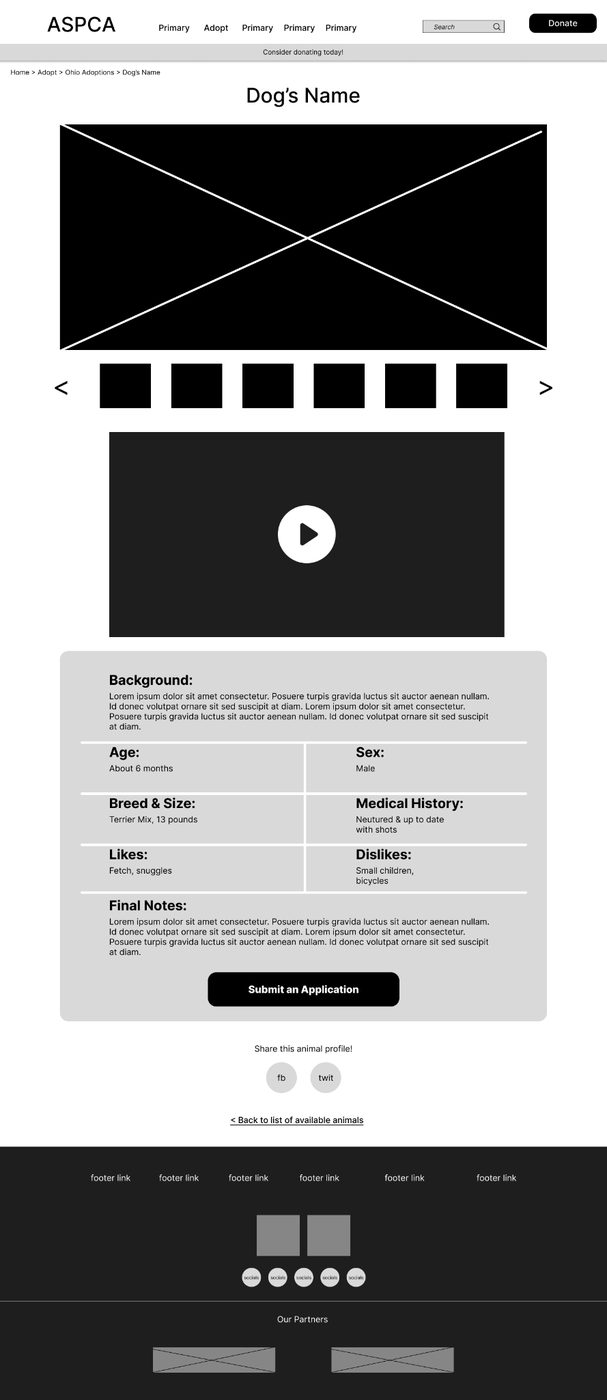
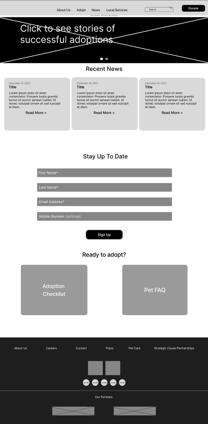
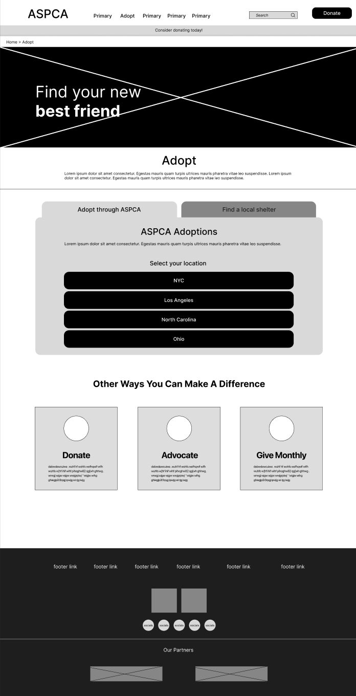
Wireframe progression, low to high fidelity
Key Design Decisions
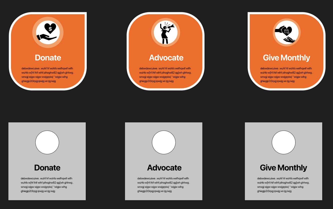
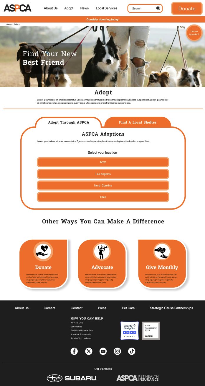
A new icon set and updated CTA cards to feel warmer and more inviting.
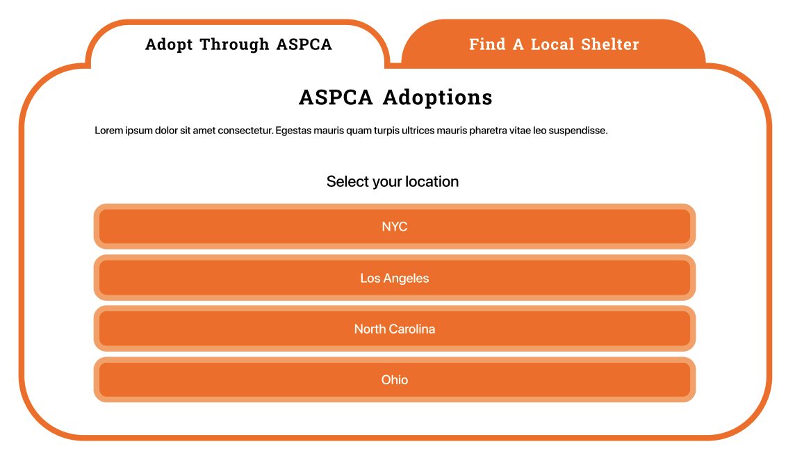
A redesigned tab navigation for clearer information hierarchy.
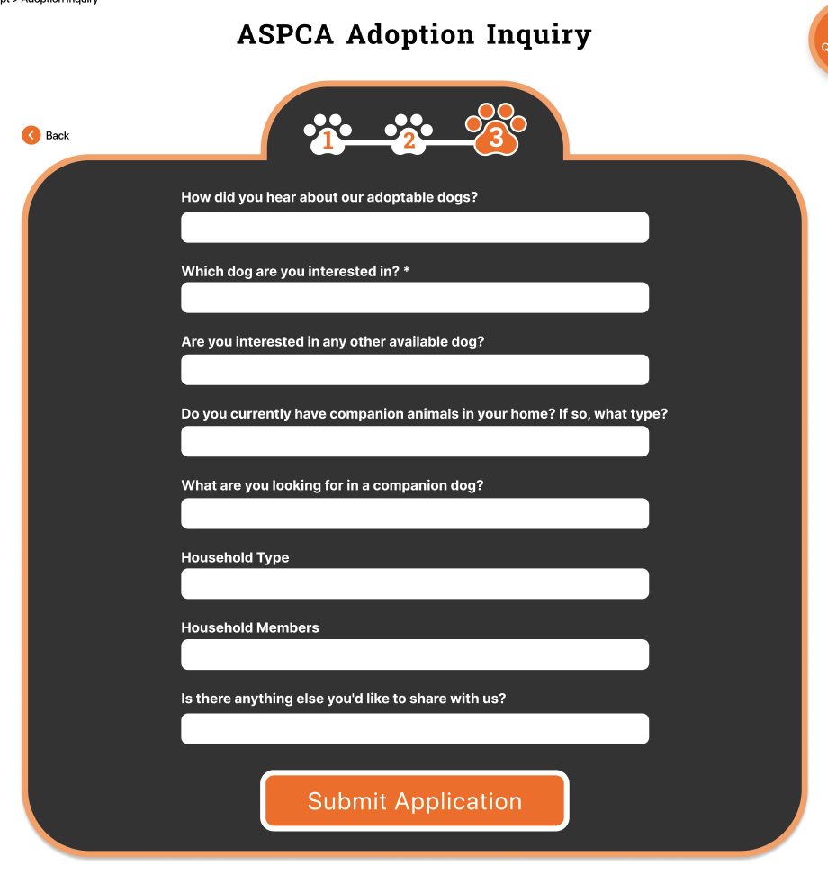
Broke the endless adoption inquiry form into digestible, encouraging chunks.
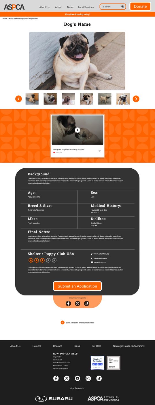
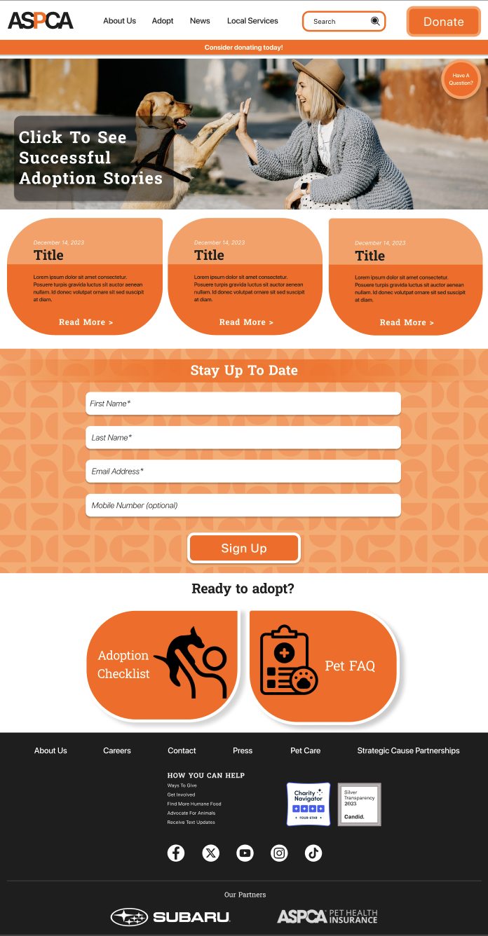
Designed for both mobile and desktop, full responsive web design.
High-Fidelity Designs
Usability Testing
We tested our prototype with real users to identify friction points before finalizing the design.
Next Steps
Develop a dedicated ASPCA mobile app. The ASPCA currently has no standalone app.
Design and flesh out the donation flow using the established style guide.